Death & Taxes

Name: Death & Taxes
Location: Reno, NV
Design: Unknown


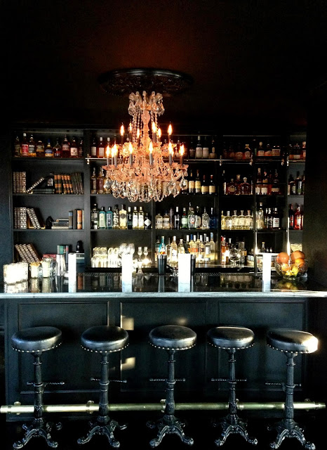
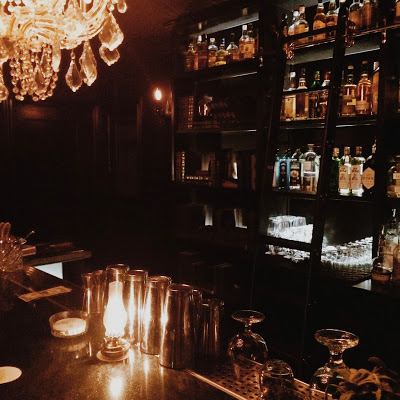
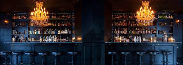
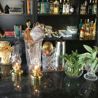
Death & Taxes is a craft cocktail bar, located in a converted bungalow, and was one of our favorite stops during a whirlwind trip to Reno this past weekend. 


With an almost all black interior, attention was paid to the subtle details. These details; high gloss trim against matte walls, subtle pattern, and hidden storage are what make this space a cohesive space and a great experience. One of my favorite details within the space was the hidden passages to the back of house. These are hidden within the bookcase and are located behind the far bay of shelving on either end of the bar. Hidden hardware and the level of finish detail makes them invisible to the naked eye. 


All images © Death & Taxes Facebook, Kaper Design, LLC


Our Work; Dryhop Brewers

Name: Dryhop Brewers
Location; Chicago, IL
Designer: Kaper Design, LLC
Scope of Work: Schematic Design, Design Development, Feasibility studies, Contract Administration,  FF&E Sourcing


Kaper Design, LLC is proud to announce the opening of Dryhop Brewers. A warm and comfortable space, our design showcases the craft of creating. With an initial concept given by the owner of 'My father's workshop on a good day.', Kaper Design created a space that played homage to the craftsmen and their crafts. Highlighting the woodworking and beer making crafts simultaneously was an exciting challenge and allowed us to get creative with materials and applications. 


The 50 foot long bar was designed by local carpenter Kevin Hughes and was based off our drawings depicting a stack of lumber. On top of the bar lies a live-edged slab sourced from a single, lightening-struck tree which was urban forested from just miles outside of Chicago. 


The tables were crafted specifically for Dryhop and feature white oak butcher block tops and cold-welded steel bases designed by us to be simplistic and unobtrusive. While our bar height tables feature steel bases showcasing a modern interpretation of a saw horse. 


Dryhop Brewers space consists of multiple spaces designed to showcase the brewing process. With custom steel and glass partition walls and black subway tile, both the brewhouse and fermentation room showcase the equipment within and highlight the process behind their great beer.


Both mens and women's restrooms continue to highlight craftsmen and their craft. Creating a custom wall mural using historic and technical images of the brewing process, history of brewing, and woodworking allowed us to tie these rooms into the overall feel of the brewery and make the diners experience a complete visit. Bathrooms are rounded out with industrial light fixtures, wood framed mirrors and penny tile floors.


Stop by for a beer and some delicious food the next time you are in Chicago!

Salt & Straw

Name: Salt & Straw
Location: Portland, OR

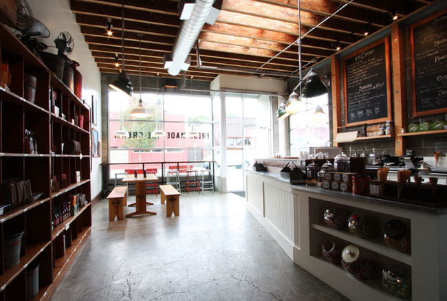
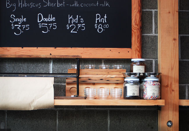
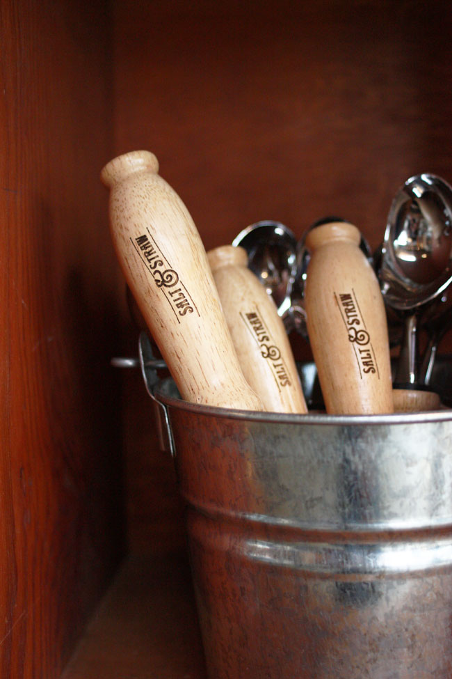
With summer in full swing, what better way to celebrate than with a scoop of ice cream from your favorite shop. Portland's Salt & Straw is a local scoop shop focused on creating unique and delicious flavors. Set inside a renovated storefront, the shop features loads of handcrafted details and warmth.

Portland commercial remodel: Salt & Straw


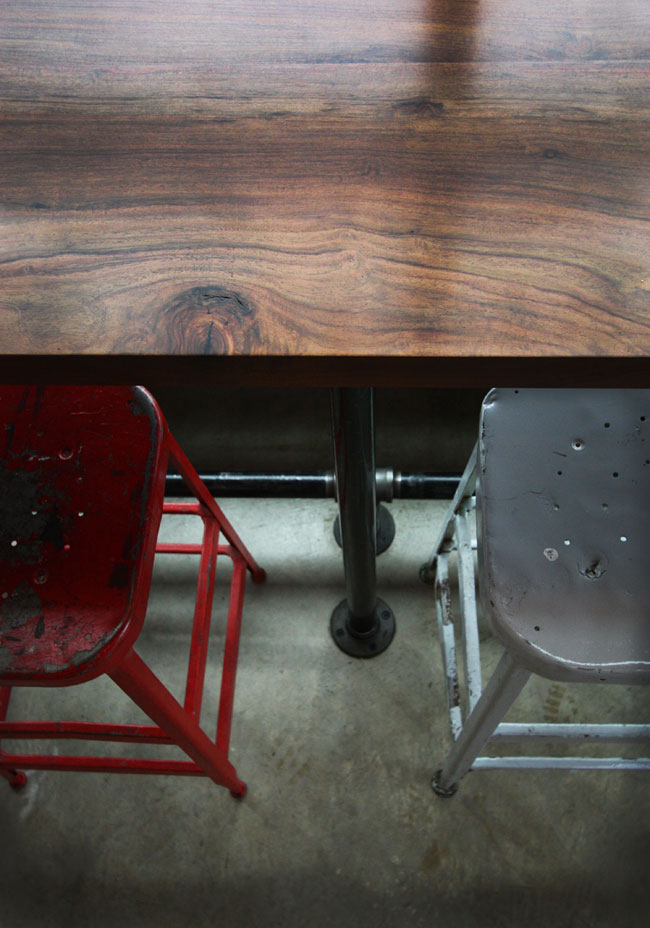
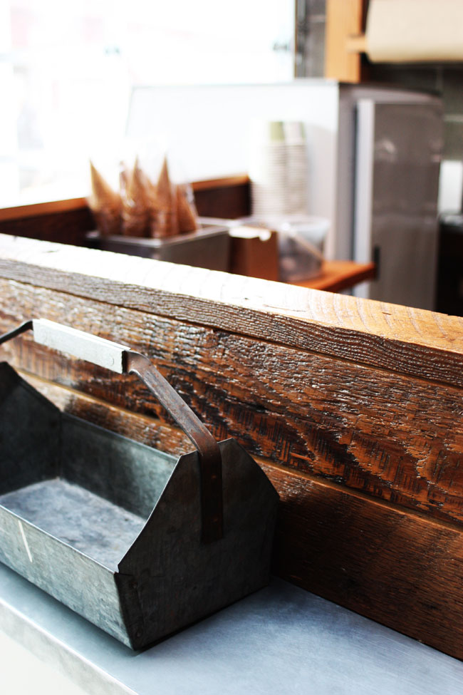
The exposed beam ceiling, handmade wood shelves behind the counter, poured concrete floor, and metal accents all add a industrial, rustic feeling to the interior. 

Portland commercial remodel: Salt & Straw

Portland commercial remodel: Salt & Straw

Portland commercial remodel: Salt & Straw

Portland commercial remodel: Salt & Straw


Photos 1-6 © Hammer and Hand

Local Favorite; Heritage Bicycles

Name: Heritage Bicycles
Location: Chicago, IL

There is little I love more than a local coffee shop on a cold chicago afternoon. The newest to hit the Chicago scene decided to raise the bar a bit and is not only supplying the windy city with Stumptown, but also with locally, handcrafted bicycles. The space merges the two beautifully. With a handmade, yet refined feel, the interior is comfortable and inviting. The long communal table in the center of the space acts as the landing ground for the the biking community to grab a cup of coffee while waiting for a tire change or tune up. Booths are upholstered with bags from beans imported by Stumptown and there is even a light fixture made from Edison bulbs and bicycle rims. Walls are decked out in moldings filled with either mirrors or chalkboards listing specials and services and add a great amount of light to the space. Overall the space feels well pulled together and just as hand crafted as the bicycles and coffee they feature.


Image 1-5 © lgrab
Image 6 © Bicycle Retailer