Essex

Name: Essex
Location: Seattle, WA
Design: tbD


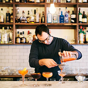
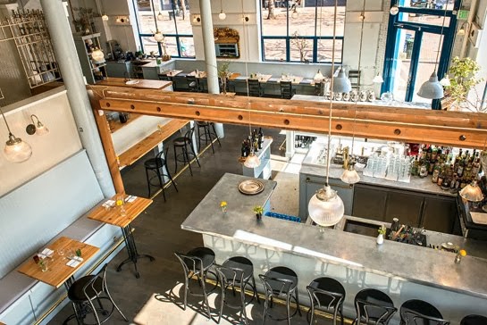
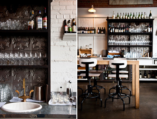
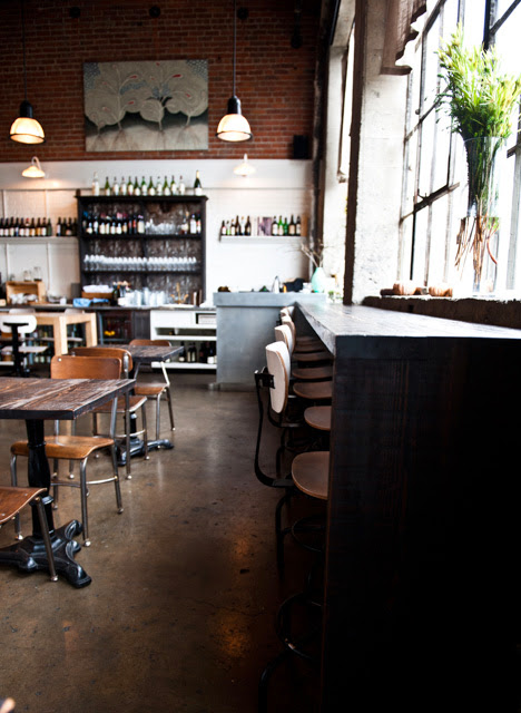
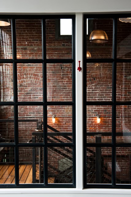
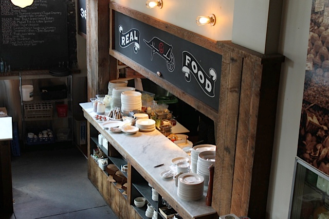
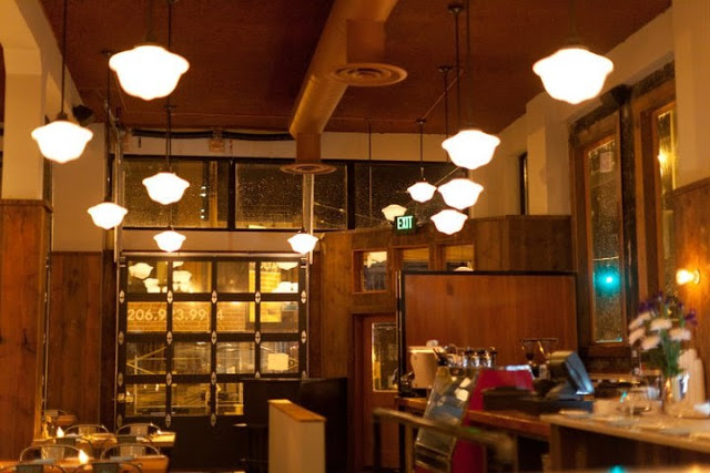
Essex, located near the Ballard area of Seattle, is a bright and inviting space that has quickly made it on my 'I need to get there' list. Playing with contrast to create balance created a welcoming space.


While utilitarian in nature, playing with geometrics and warm colors woods helps the interior come alive. 


The contrast between the warm woods and bright whites of the back bar and countertops helps to maintain the brightness within the space while also creating a balanced and cohesive interior. 


Bar Sajor

Name: Bar Sajor
Location: Seattle, Wa
Design:

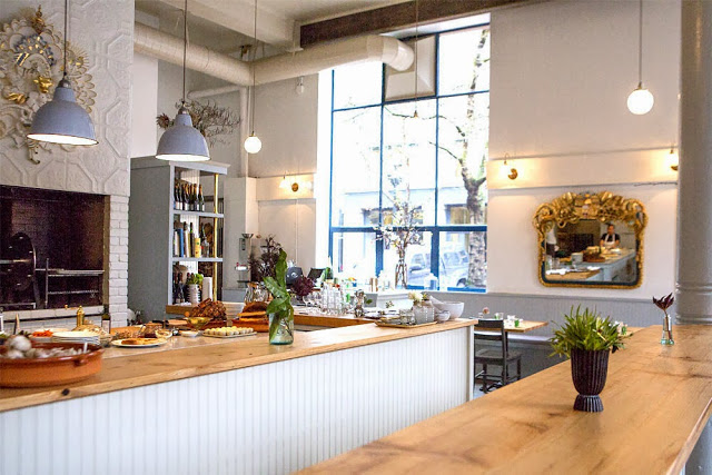
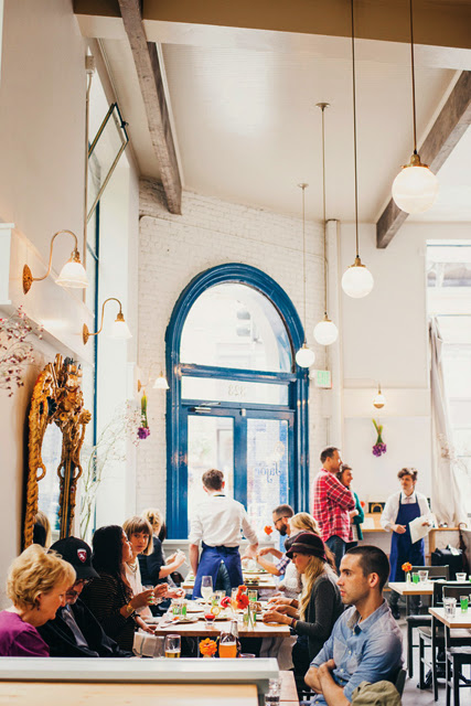
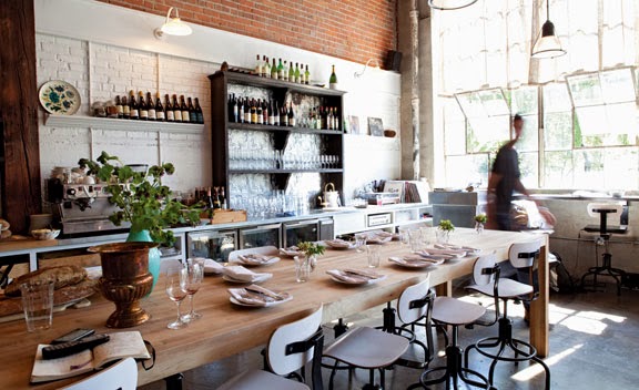
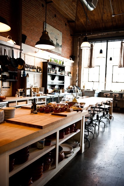
Matt Dillon, 2012 James Beard Award Winner and chef/restauranteur behind Sitka and Spruce, opened up Bar Sajor early this year in Pioneer square.  With a similar open kitchen layout and earthy lightness, the interior feels like a more 'dressed up' version of Sitka & Spruce in all the right ways.


Using blonde woods, white bead board, and cool grays keeps the space chic and polished while remaining warm. The exposed rotisserie oven and exposed wood beams add a rustic touch that help keep the interior tied to the buildings historic roots. 


Images 1 & 2 © Architectural Digest
Image 3 © Eater Seattle
Image 4 © Bon Appetite

TanakaSan

Name: TanakaSan
Location: Seattle, WA
Designer: Graham Baba Architects.


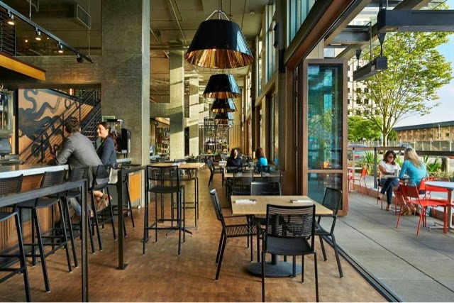
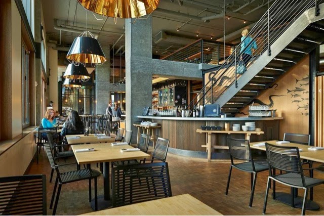
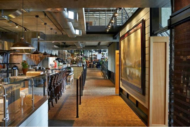
Warm, urban, and inviting TanakaSan, located in Assembly Hall, has it all going for it. As one of a handful of dining spaces among the Assembly Hall collection, TanakaSan faced some interesting special challenges.


With the kitchen separated from the dining space, a small bar was added which allows breakfast to be served in the morning and adds extra seating for casual drinks or overflow diners. 

The space is open, light, and industrial but remains comfortable and warm. The constant movement of the space and doors that open onto the patio add energy to the space and allow it to keep a constant connection to everyone coming and going through the building.


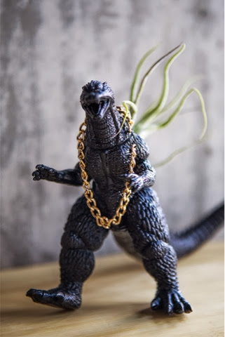
All of the tables are clean lined and light with airy black slat seating. Proving the restaurant is anything but traditional, each table is outfitted with a plastic animal (typically a dinasour of some sort) adorned with a metal chain and/or plant situated in its back.


All images via Via6 Facebook, Suzie Pratt Flickr , & Unknown

Sitka & Spruce

Name: Sitka & Spruce
Location: Seattle, WA
Design: Unkown


Located in Melrose Market, a vintage auto garage dating back to 1919 and 1928 respectively, Sitka & Spruce has quickly climbed to the top of my Seattle restaurant list. With an over the top open concept and location amongst exceptional vendors, it's easy to see why. 


The converted garage spaces feature cement columns, exposed brick, and beautiful industrial windows. With the dining and kitchen sharing a singular space, you easily feel as if you are eating in someone's kitchen. 


The industrial structure paired with classic paneling, industrial and vintage furnishings create a perfect mix of relaxed style. 


Photo 2© Seattle Mag
Photos 1, 3-5 © Kimberly Taylor Images

Local 360

Name: Local 360
Location: Seattle, WA
Graphic Design: Sleep Op


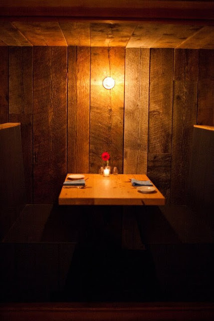
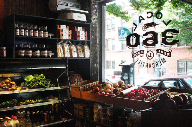
Another great spot in Seattle is Local 360. Located in the Belltown neighborhood, it focus on locally sourced, sustainable fare. The interior follows creating a rustic and warm interior using barn wood,  vintage style pendants, and intimate spaces for diners.


The use of multiple wood types creates a warm, rustic, and trendy interior while the marble counters and tolex-esq chairs add balance by adding polished, industrial touches.


 Photos ©  Local 360 & Sleep Op

The Whale Wins

Name: The Whale Wins
Location: Seattle, WA
Design/Arch: Heliotrope Architects


Most commercial and hospitality designers I've had the pleasure of talking with all mention the same thing; It's hard to design for yourself. As a designer, you typically find interest, beauty, and inspiration in multiple styles. This allows us to design spaces across the board for whatever our clients are looking for, or need, to make their space a success. This is a great skill to have as a designer but it usually means your own space is a bit of a mash up of styles and explorations. I myself am included in this generalization and am constantly on the look out for a style that might perfectly suit my family and current space. The Whale Wins is the closest I've found to anything I could call my own personal style. 


The space is the perfect balance of coastal charm, scandinavian lightness, and industrial warmth.  
An inviting trio in any book. 


Keeping the space bright and white allows for a space with a simplistic, feminine quality while the the stacked lumber, and exposed beams add a touch of warmth.


The simplistic light fixtures add a touch of humor and fun to the space creating the warm and welcoming atmosphere. 


The Walrus and the Carpenter

Name: The Walrus and the Carpenter
Location: Seattle, WA

Seattle is one of those places that I've wanted to get to forever. For whatever reason though, I just never make it up there, no matter how close I am. After seeing images from The walrus and the Carpenter, a new oyster bar, I may need to make a point of getting over there sooner rather than later.

The restaurants name came from the Lewis Carroll poem and much like the poem, the space evokes a sense of happiness, warmth and light-heartedness. The distressed wood floors and reclaimed materials add to the casual warmth of the space, while the painted metal stools, light fixture and custom zinc bar add a bit of whimsy and fun into the space. Set beautiful and plentiful oysters in this settings and you have the perfect neighborhood spot.