Garage Project

Name: Garage Project
Location:Wellington, New Zealand  
Design: Matt Smith, Common Goods


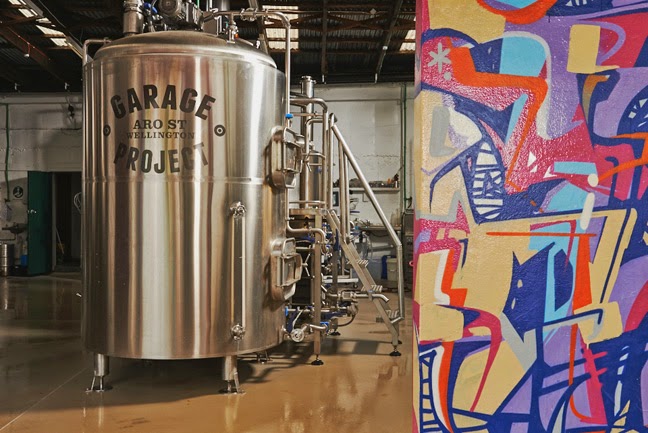
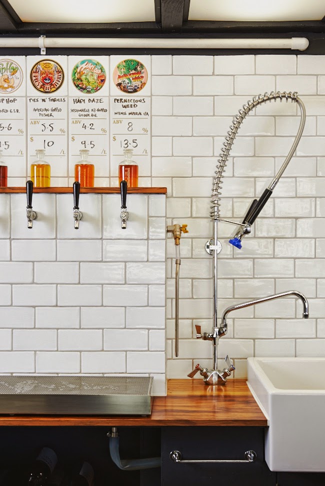
We love a good brewery and Garage Project, located in New Zealand, has recently grabbed our attention for its bold use of color, urban exterior, and simple tasting bar. 


Using a limited material palate, polished subway tiles contrast the warm wood bar and allow the beer on tap to shine.


With industrial and midcentury nods, the overall space compliments the polish and industrial nature of the brewing equipment adjacent. 


All images © Fancy!

The Riding House Cafe

Name: The Riding House Cafe
Location: London
Architect: Lou Davis


Classic style lovingly pairs with vintage wares at The Riding House Cafe. Repurposed theater chairs, industrial accents, and rich wood layer together to create a warm and welcoming space.


The pop of blue found on the barstools and tile border add a refreshing contrast to the warm wood and industrial accents.


Industrial open shelving located at the kitchen pass and behind the bar add enough weight to provide visual separation while still allowing light and sight lines into the spaces.


Curated chotchkies; one of the very few examples of this done well within a restaurant space due to it's restricted nature.


Outsider Tart

Name: Outsider Tart
Location: London


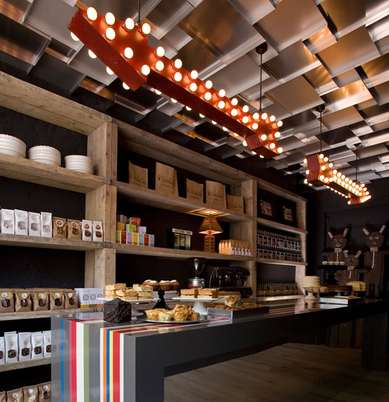
Located in London, Outsider Tart is a bakery & cafe that perfectly juxtaposes rustic and whimsy.


Utilizing vintage and found items and contrasting them with rustic displays and bright colors creates a perfectly balanced interior.


With limited space, every detail had to be thought through to make sure it made just the right impact. Maximizing space using the long display table in the middle creates flow while also breaking up the space. 

One of my favorite elements in the space is the ceiling that was created with sheet pans. Utilizing ordinary materials in unexpected ways also helps drive home the whimsy aspect of the cafe. 


Image 1-3 © We Heart

Cafe Foam

Name: Cafe Foam
Location: Stockholm
Design: Note

I love a good pop of pink as much as the next girl, but it has to be done correctly. The wrong tone or shade and the wrong application can completely ruin any good pink intention.
Cafe foam, located in Stockholm, created a cafe with vibrant pink splashed through. It's just enough to create a punch and some visual interest while allowing the blonde wood and scandinavian vibe to be aptly apparent. What do you think, too much?


cafe foam interior

cafe foam side

cafe foam bookshelf

All images © Dwell


Nando's

Name: Nando's
Location: Kent, England (Originally started in South Africa)
Designer: Blacksheep

Chain restaurants typically don't do much for me on the design front. However, it seems more and more brands are starting to realize the importance design makes in a successful business, chain or not.
With brands like McDonalds and Starbucks hiring design firms and rebranding their store experiences, it seems our interactions with chain restaurants could drastically change over the next few years. One chain that clearly recognizes the importance of design on brand recognition is Nando's. Originally of South Africa, they have expanded globally. The space below, located in England was designed by Blacksheep is tastefully done. Utilizing natural materials and playing with color, they have managed to achieve a space that feels original and unique while also remaining warm and inviting.


All images © Design Milk


A colorful treat; The Pantone® Hotel

Name: Pantone® Hotel
Location: Brussels, Belgium
Designer: Michel Penneman & Olivier Hannaert

I have yet to meet a designer who doesn't love Pantone®. The color standard for almost all creative fields, their iconic branding has established a loyalty in even the most color-phobic among us. In the past few years, Pantone has done an excellent job at not only remaining relevant, but also main stream and desirable. The product design that has come out in full force as of recent, has established a renewed love within me and I was overjoyed to see an entire space dedicated to the love of color and color theory.


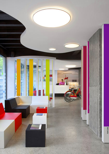
Each room and floor is themed based on color. Guests can choose the color or emotion they would like to experience and will receive a unique space catered to that very color. 


Besides the rooms, the public spaces throughout the hotel are also coated in intense, saturated colors. 


Image 1 © Karen Haller
Images 2-3 © Dezeen
Images 4-6 © Apartment Therapy
Image 7- 9 © NY Times