Nomad Coffee

Name:

Nomad Coffee

Location: Barcelona

Design: Unknown

There is something great about the simplicity and unfussy nature of Nomad Coffee. Located in Barcelona, Nomad started out as a small cart and has since transitioned to a brick and mortar space, their name speaking to their roots. 

The unimposing and warm facade welcomes you into a communal space with a utilitarian aesthetic that emphasizes the craft and connection.

Image 1, 2 ©

Fuet Magazine

Image 3 ©

The Soup Spoon

Wallace & Ed


Name: Wallace & Ed
Location: Melbourne, Australia
Architecture: Woods Bagot


Trends have funny way of always coming back. Wallace & Ed, located in a former Hard Rock Cafe, showcases this phenomenon perfectly with the updated use of wood panels, wrought iron, and simplicity.


Keeping the material palate simple and lines clean allows the play of geometric pattern to take center stage. 


By limiting the use of the panels and incorporating exposed concrete and warm wood floors, the space remains industrial and modern.


All images © The MP Report

Maison

Name: Maison
Location: South Africa
Design:


I love the simplicity and openness that is shown throughout Maison. A winery with a tasting room, deli, and restaurant; all spaces work in harmony but still give a large graphic punch. 


The use of blonde wood, stark acrylic chairs, and polished white creates an airiness throughout the space. Paired with the worn barn wood, stacked logs, and wine bottle chandelier, each spaces still exuded warmth and remains inviting. 


The use of furniture and fixtures that are also light and airy in appearance helps extend the open feeling of the space. 


 Images © Weheartco & Maison


Dock Kitchen

Name: Dock Kitchen
Location: London


With a beautiful location and proximity to Tom Dixon's shop, Dock Kitchen was set up for success from the beginning. With exposed brick walls, a spectacular view, and attention to detail the space strikes a beautiful balance of refined rustic.


The truly welcoming open kitchen gives off the feeling of being in a friends kitchen. Balanced with the quality of materials used in the dining room and clean lines and polished details of the dining room, the space feels upscale and memorable while also feeling comfortable and welcoming.


I love the simplicity of the space and enjoy that the truss's, ceiling, and walls were all left exposed, highlighting the original structure and history of the space.


Image 1-3 © The Selby
Image 4- © Weheart

Lady M Confections

Name: Lady M Confections
Location: New York, NY
Design: Sam Trimble


Lady M Confections signature space treats their cakes and pastures, very appropriately, as the star of the show. 
With clean lines, a neural color palate and minimalist details, all eyes are directed towards the 20+ foot refrigerated display case where the colors and textures of the beautiful pastries is on full display. 


Using clean and simple sneeze guards paired with the open leg base and stone front, there is very little to distract the eye and treats the items within as jewelry on display for passing admirers. 


Photos 1-4 © Lady M Confections

Matchstick Coffee

Name: Matchstick Coffee
Location: Vancouver, BC


Matchstick, located in Vancouver, is a great example of a well thought through concept on a small budget. 


Matchstick's branding and logo evoke the warmth and playfulness of their owners while also drawing connection to the handcrafted quality of their product.


Matchstick did a great job understanding their concept and core identity and portraying it to the public through their use of simple, raw materials and clean color palate. 


The minimalism created inside of the space not only helps with small budgets, but also keeps the interior unfussy and uncluttered. This direction thoughtfulness of objects and space speaks to the owners clear vision of their brand and product. 


The large, live edge community table is one of the largest visual components of the space (other than the long service bar on the opposite wall) and emphasizes Matchsticks desire to be a community gathering space. This long table can transform to meet multiple needs through the day in a variety of situations and brings people together.


Large groupings of the same artists work create a much bigger visual effect than their initial cost.


Images 2,3 © Matchstick Facebook
Image 4 © Raul P Flickr
Image 5-7 © Cleanhotdry

Bar & Co

Name: Bar & Co/ Kitchen & Co
Location: Helsinki, Finland
Design: Joanna Laajisto


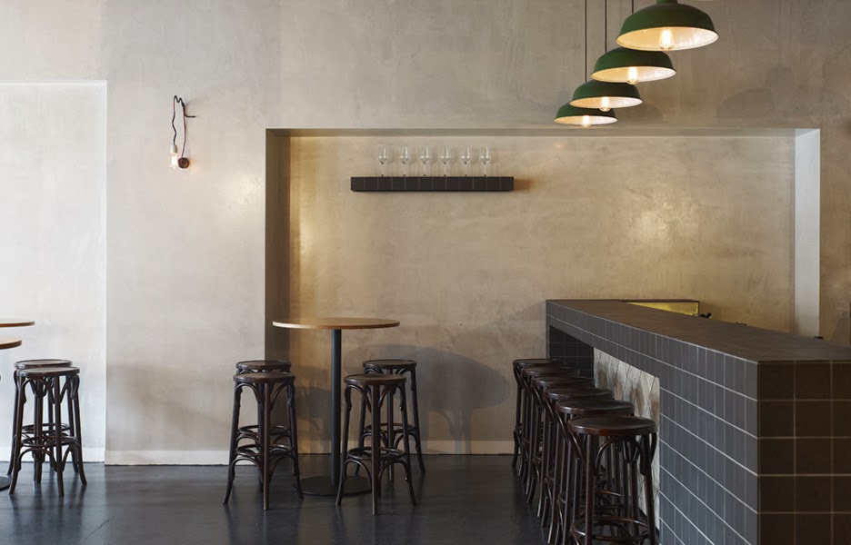
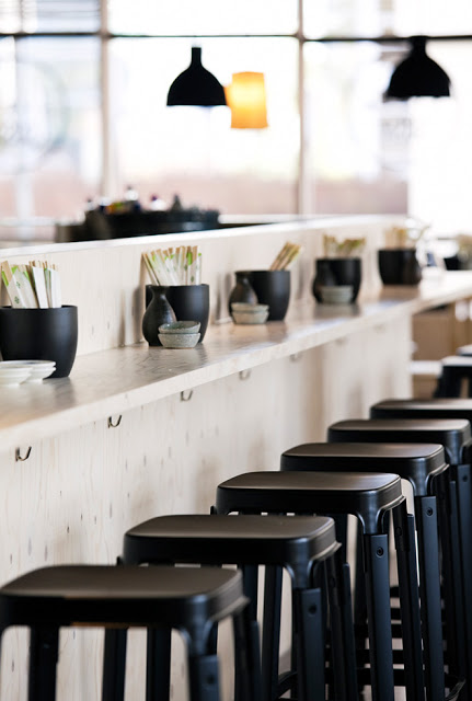
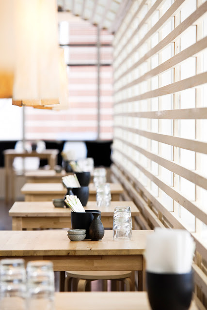
Located in Helsinki, Bar & Co was designed to outlive trends. In order to create this, timeless materials and thoughtful approach were used.


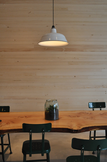
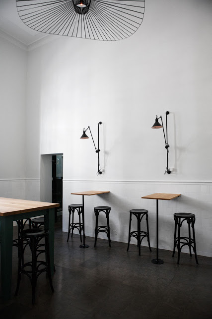
The space was divided up into three rooms, the butcher's room, the library, and the smoking room. These spaced all have their own identity and feeling but also feel united and continuous. 

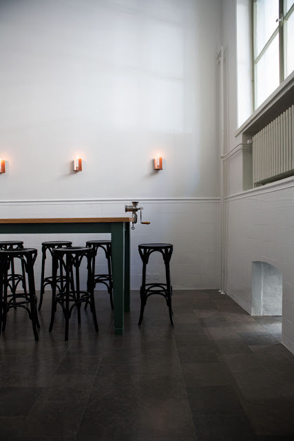
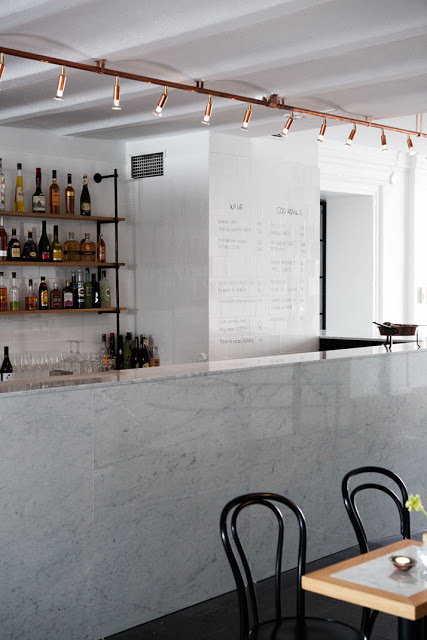
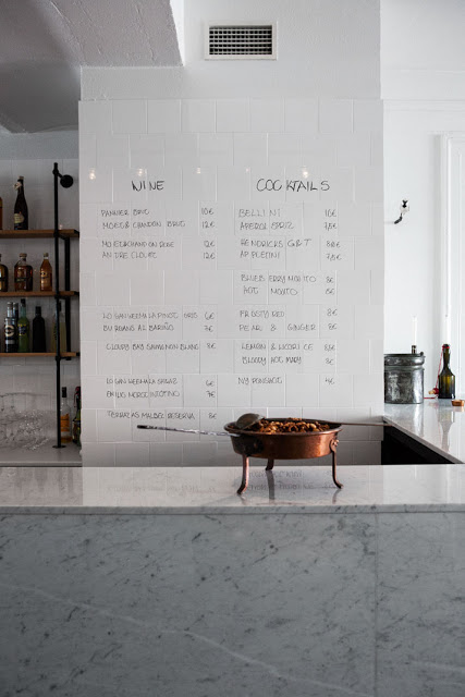
The butchers room features Carrera marble, clean white walls, subway tiles and industrial fixtures and accessories. 
I adore the meat grinder detail as well as the industrial yet simple wall fixtures.


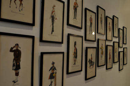
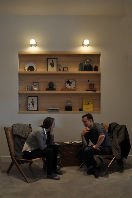
The library introduces warm textures and textiles while still remaining clean and distinctly finnish.


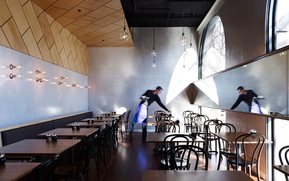
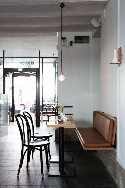
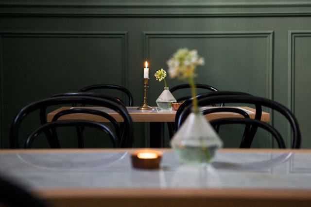
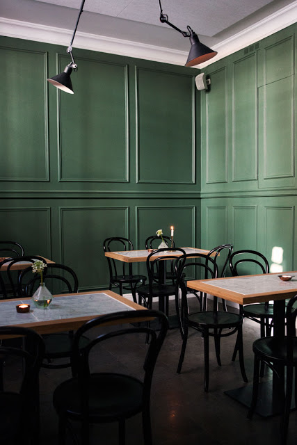
From here, you transition into the smoking room which continues the green introduced in the library. Adding moulding and bistro chairs gives the space a distinct bistro-feel while also remaining clean and uncomplicated.


All photos © Mikko Ryhänen via Yatzer

Tiger Sushi

Name: Tiger Sushi
Location: Finland
Design: Joanna Laajisto


Tiger Sushi is a great example of two cultures and style meeting to create a clean and minimalist interior.


The blonde wood, black and white color scheme, and focus on simplicity keeps the interior fresh and bright. These characteristics create a feeling of freshness and lightness, both fitting for the light and fresh cuisine being served. 


All photos ©  Joanna Laajisto