
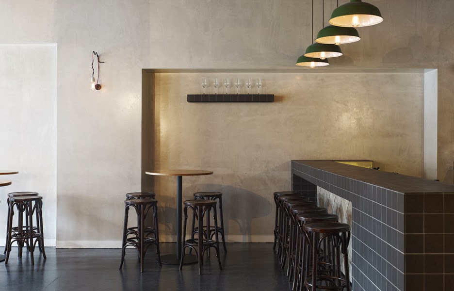
Name: The Potting Shed (at the Grounds of Alexandria)
Location: Melbourne, Australia
Design: Acme & Co

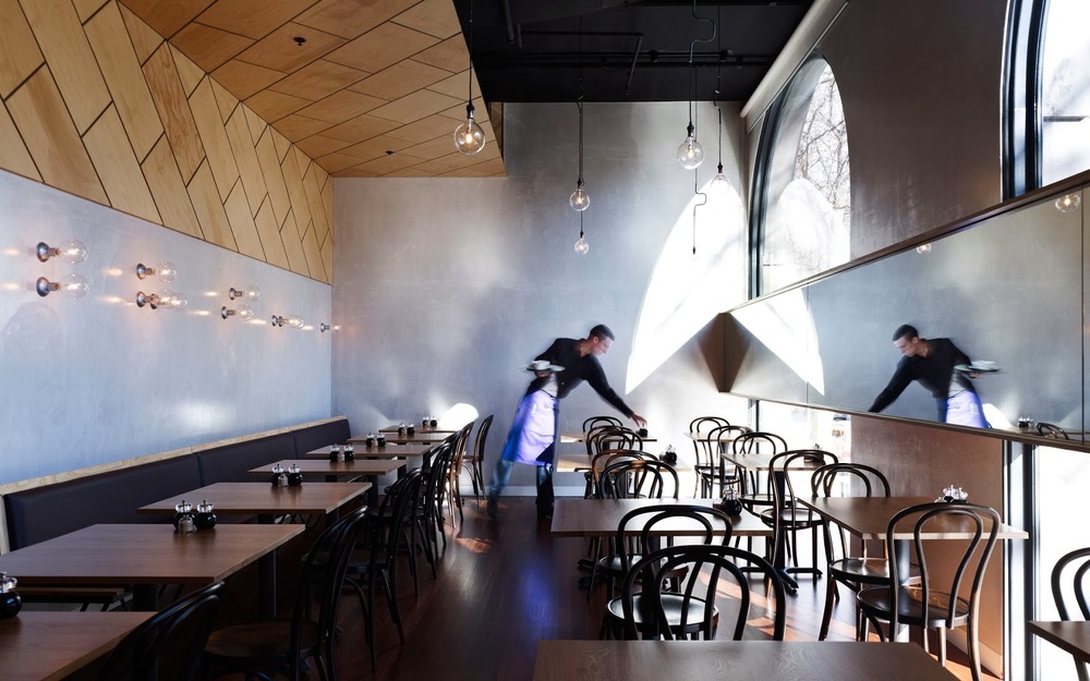
Location: Melbourne, Australia
Design: Acme & Co
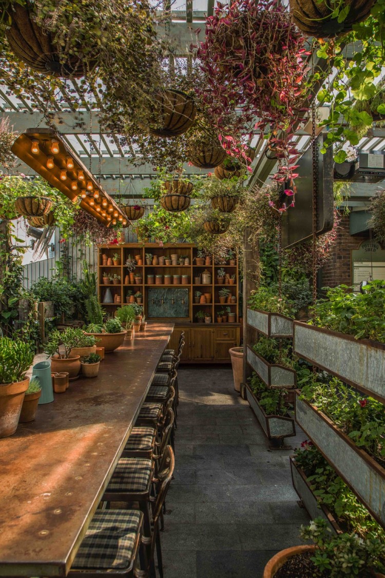
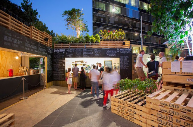
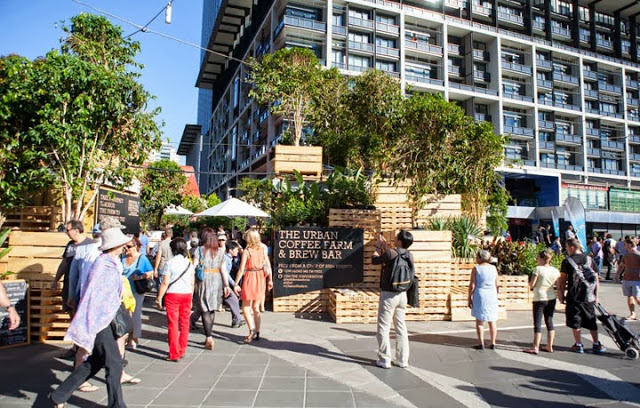
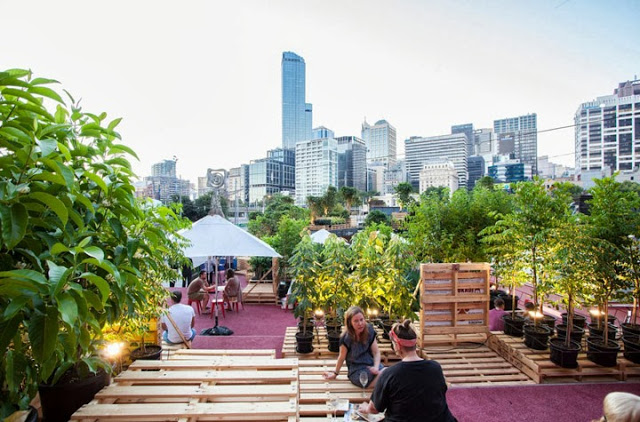
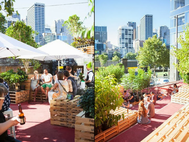
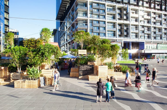
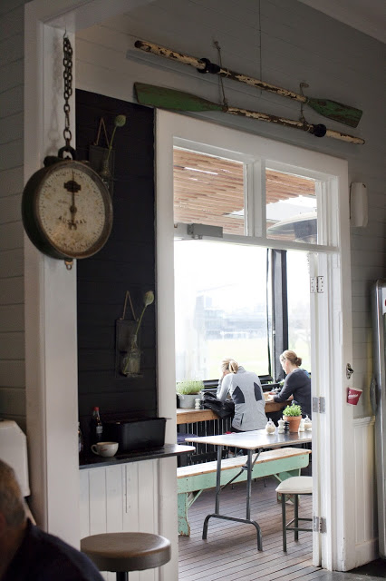
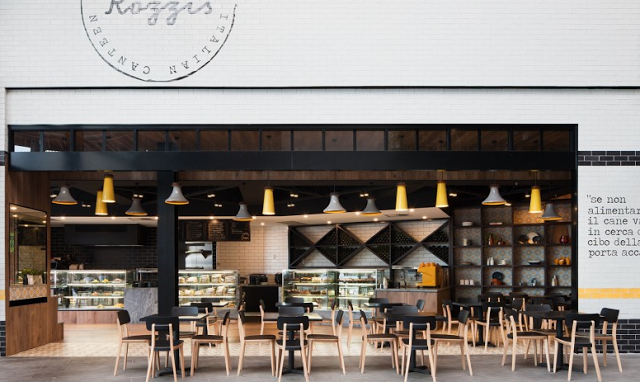
It looks like The Grounds of Alexandria has been growing; both literally & figuratively. One of the newest additions to their already beautiful space (Check out photos of their roaster and cafe, here.) is The Potting Shed. This patio addition does a great job blending into the grounds and creates a welcoming retreat.
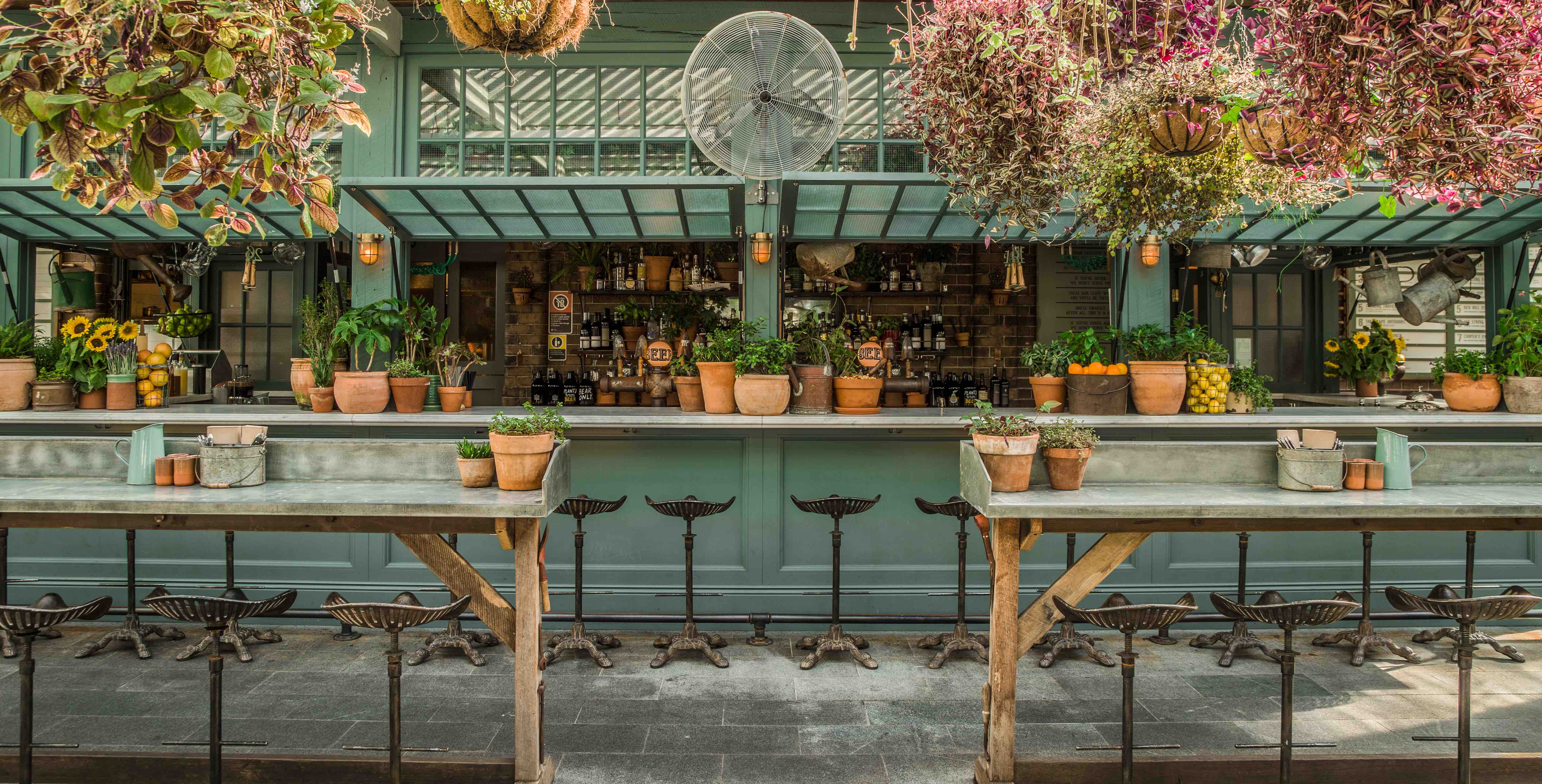
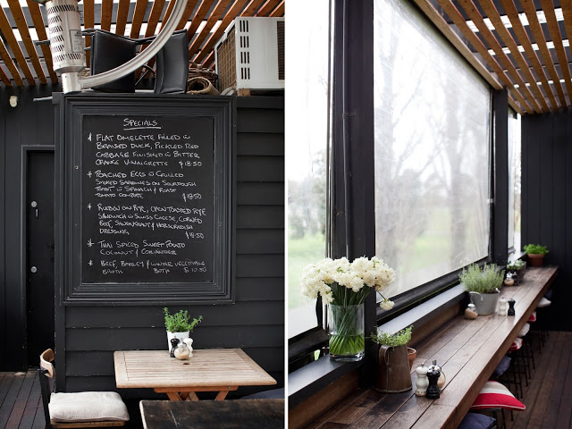
Check out the custom draft tower and more images after the jump-
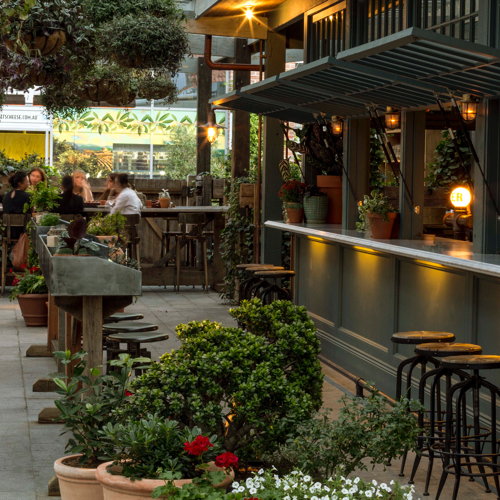
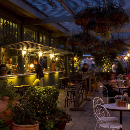
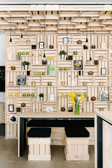
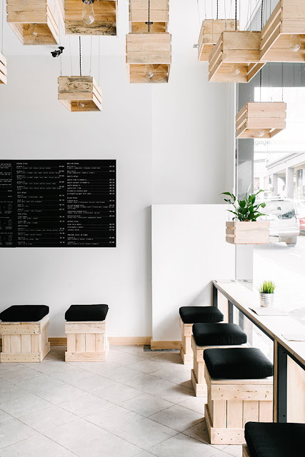
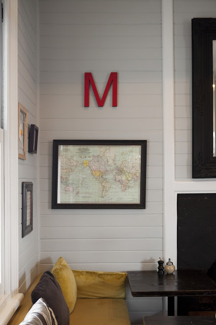
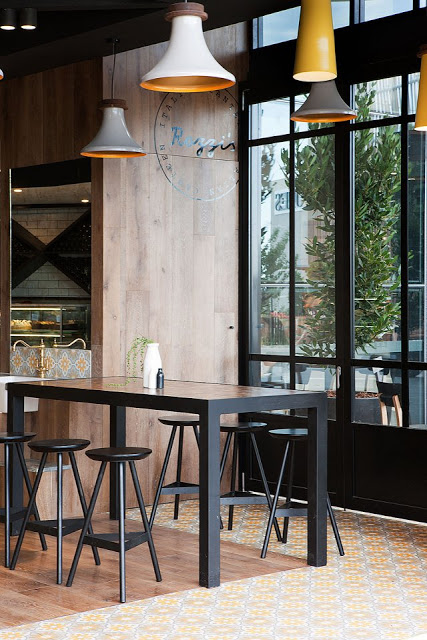
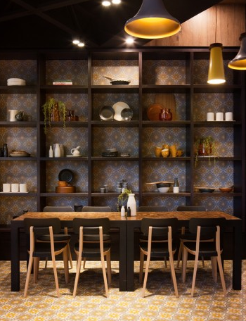
As the name implies, The Potting Shed was designed to resemble just that. Warm shades of green, mismatched patio chairs, and potting tables all help tie the theme together and give you the impression you truly are enjoying your beverage in their garden.
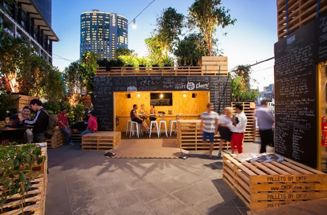
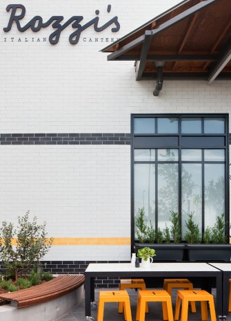
We love the shed itself, with it's operable windows opening up to become the bar and custom draft tower. The brick backdrop and tractor stools add one more layer of warmth to this local watering hole.
Image 1, 4 @ The Grounds of Alexandria
Images 2, 3, 5 © The Daily Addict


