Alfred Coffee

Name: Alfred Coffee
Location: Los Angeles, CA (Multiple)
Design: Joshua Zad


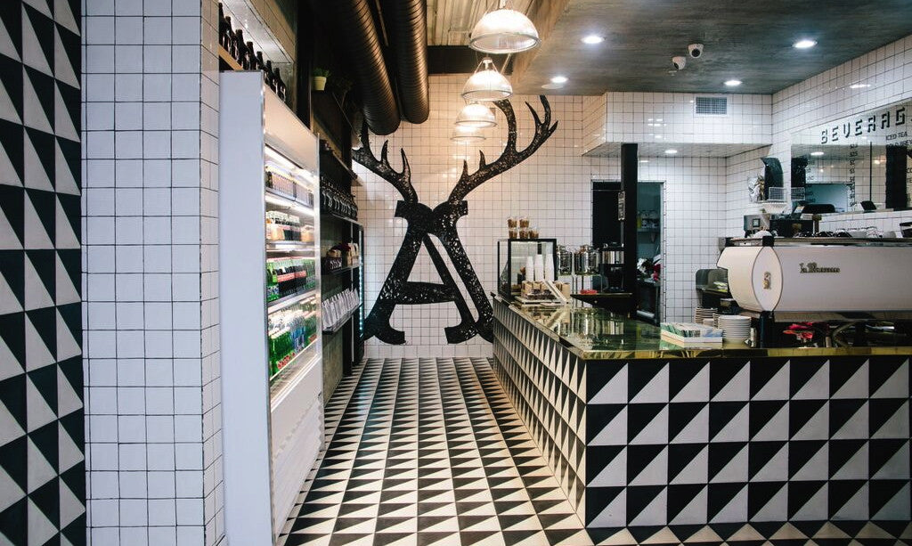
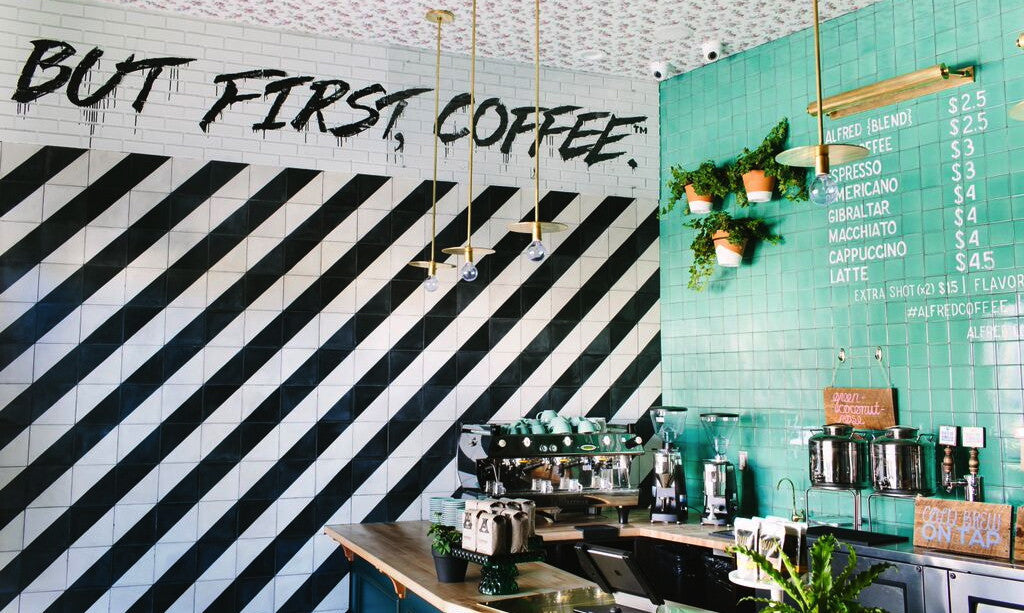
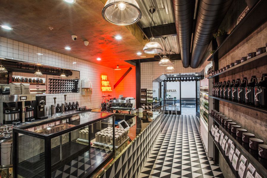
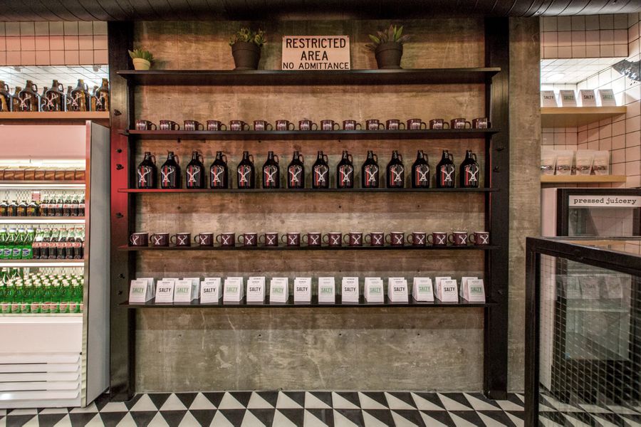
One look around the Alfred Coffee in the Alley location and you'll realize this is not your typical coffee shop. Bolder than what we are used to, it creates a great buzz of energy that is refreshing from a design stand point. 


Keeping it simple with black and white, the play with contrast and shape help create a dynamic interior that is anything but traditional. 


Personally, I love the use of the red neon and the gold counters. They elevate the otherwise simple materials and create a great energy within the space. The addition of aqua in the Brentwood location act in the same manner, keeping the space bold but still approachable and refreshing. 


Photos 1-3 © Alfred Coffee
Image 4- 6© Eater LA


Wexler's Deli

Name: Wexler's Deli
Location: Grand Central Market, LA
Design: J. Marx


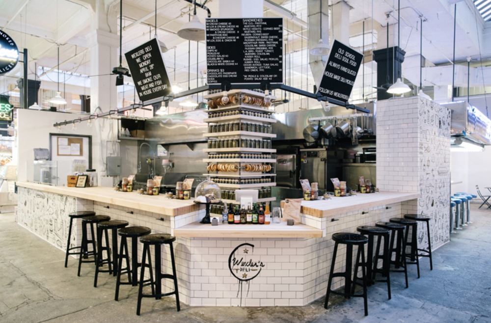
There is something so wonderfully unpretentious and warm about the classic deli feel. Clean, white subway tiles accentuated by the stainless steel equipment and butcher block counters seem to create the perfect backdrop for vibrant ingredients. 

Read on for more images-


Located in LA's Grand Central Market, Wexler's stands out with it's bold sense of style; effortlessly mixing classic New York deli with hip LA culture. We love the graphic illustrations applied to the subway tile and the display of bagels and pickles lining the otherwise impeding structural column. 


All images © Wexler's Deli

Umami Burger Arts

Name: Umami Burger Arts
Location: Los Angeles, CA
Design: Westin Mitchell


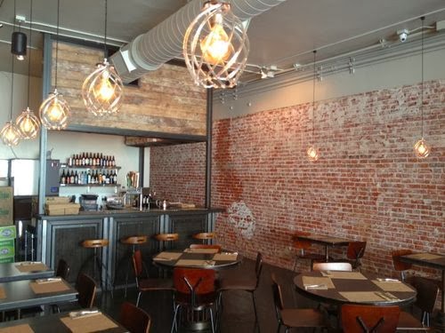
As a chain of restaurants, Umami Burger did a great job crafting an industrial and warm space utilizing exposed, raw brick and muted tones. 


The updated pendant fixtures using exposed bulbs are a great tack on the trend while allowing them to take on their own personality. While not adding much to the space, they were able to create a small bar and separate the open storage from the dining area by utilizing a custom reclaimed wood and metal structure. 


I love that the colors of the brick, warm leather, and oxidized copper are used throughout the space to create a cohesive and warm interior. 


All images © LA Eater

Messhall

Name: Mess Hall
Location: Los Angeles, CA
Design: StudioUnltd


With a mix of mid century modern and rustic, Messhall creates a space that fits well within it's historic dome roofed structure. 


 Industrial stools, wood clad walls, and a color palate reminiscent of days at camp all come together to form a space much more pulled together than I remember my camp mess hall being!


I love that they used a common, everyday object- the divided dining tray, and created a a great visual that ties into the concept. 


All Images © StudioUnltd


Laurel Hardware

Name: Laurel Hardware
Location: West Hollywood, CA
Design: Sam Marshall


Located inside of a converted hardware store, appropriately named Laurel Hardware creates a space with a great mix of industrial and vintage.


When repurposing the space, they kept true to its industrial and warehouse beginnings while adding large windows to both sides connecting diners to the outside.


Large expanses of floral wallpaper and reclaimed wood add a touch of girly chic to balance out the exposed wood beams and industrial furnishings.


Keeping the materials natural and the addition of large windows keeps the space bright and inviting.


Image 1, 3, 4 © Remodelista
Images 2, 5, 6 © LA Confidential

The Redbury

Name: The Redbury
Location: Los Angeles, CA
Designer: sbe + Matthew Rolston 

Words cannot describe the beauty I just stumbled across. LA is typically not my first choice of travel destination (although with the vastly growing food scene and public transit gaining ground, it may be soon!). This hotel and restaurant are fun, quirky, and yet beautifully curated and refined. Take a look at the plethora of photos below and you will quickly see why The Redbury has jumped to the top of my LA list.


All photos © The Redbury